
Usage
For: Platform operators and finance teams analyzing request volume and token consumption over time.
Operations Overview | Records | Usage | Analytics Overview | Analytics → Spend
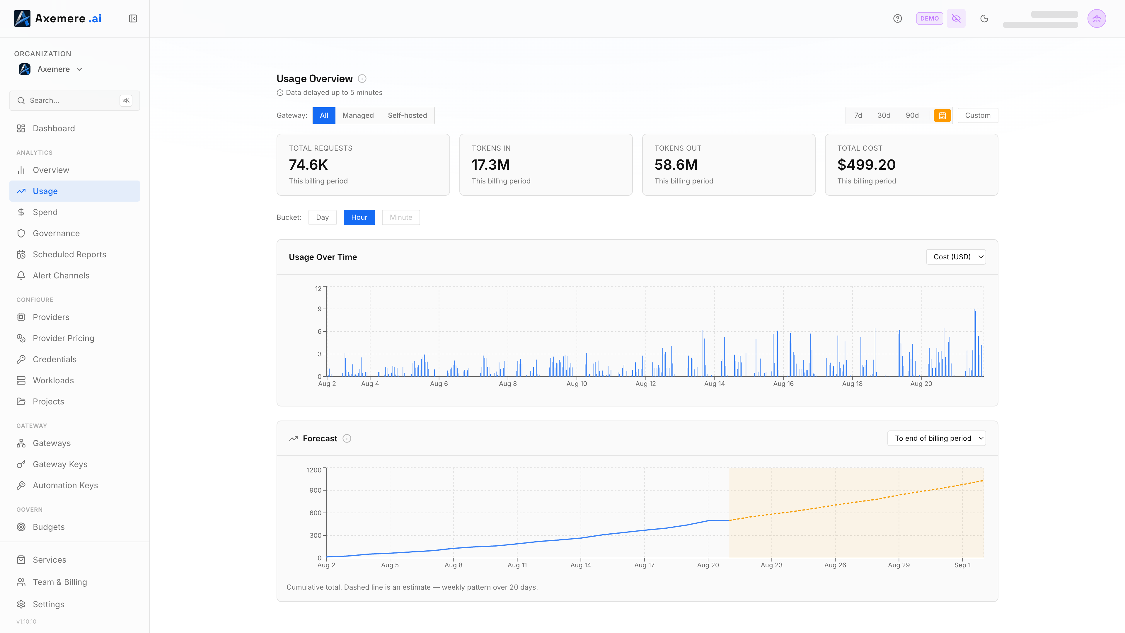
The Usage page provides time-series charts and a forecast of request counts, token consumption, and cost, with flexible period selection, bucket granularity, and a gateway-type filter.
Navigation: console.axemere.ai/usage
Required: Core Platform package.
Table of Contents
Usage Overview
The top section shows four summary tiles for the selected period, each computed from the chart's current data (so they reflect whatever gateway-type filter is active):
| Metric | Description |
|---|---|
| Total Requests | Number of requests routed through the gateway |
| Tokens In | Total input tokens consumed |
| Tokens Out | Total output tokens generated |
| Total Cost | Computed cost_usd for the period |
Data is delayed up to 5 minutes.
Period Selection
Choose a time window using the period selector:
| Option | Description |
|---|---|
| Last 7 days | Rolling 7-day window |
| Last 30 days | Rolling 30-day window |
| Last 90 days | Rolling 90-day window |
| Billing period | Current billing period (requires active managed gateway subscription) |
| Custom | Enter a specific start and end date/time |
Your period selection is saved across sessions. A Custom toggle next to the period selector reveals explicit start/end date pickers for an arbitrary range.
Bucket Size
A Bucket control (Day / Hour / Minute) sets the time-series chart's granularity — this is a manual choice, not automatic. Finer buckets are capped to shorter ranges so the x-axis stays legible (Minute up to 7 days, Hour up to 30 days, Day unlimited); a bucket that's no longer valid for the selected range is disabled, and if your current selection becomes invalid after widening the range, it automatically drops to the coarsest bucket that still fits.
Usage Over Time
A bar chart of the selected metric (Requests, Tokens In, Tokens Out, or Cost — same dropdown as the summary tiles) bucketed at the chosen size. Idle buckets with no traffic are filled in as zero-value bars rather than skipped, so gaps in activity are visible instead of compressed away.
Forecast
Below the time-series chart, a cumulative forecast projects the selected metric forward from your current lookback period to a chosen horizon (end of billing period, or a fixed number of days). The solid line is actual cumulative usage to date; the dashed line is the projection, using a weekly-seasonal trend model when there's enough history (two full weeks), otherwise falling back to a plain trend line. This is a naive extrapolation meant as a rough estimate, not a guarantee.
Gateway Type Filter
When your organization has both managed and self-hosted gateways, use the Gateway Type filter in the overview section to isolate traffic:
| Filter | Shows |
|---|---|
| All | Combined traffic |
| Managed | Axemere-hosted gateway traffic only |
| Self-Hosted | Your own deployed gateway traffic only |
Related: Records | Analytics Overview | Analytics → Spend | Dashboard