
Dashboard
The Dashboard is the first page you see when you open the Local Console. It gives you a real-time view of gateway activity across four metric cards, two charts, and four leaderboard sections.
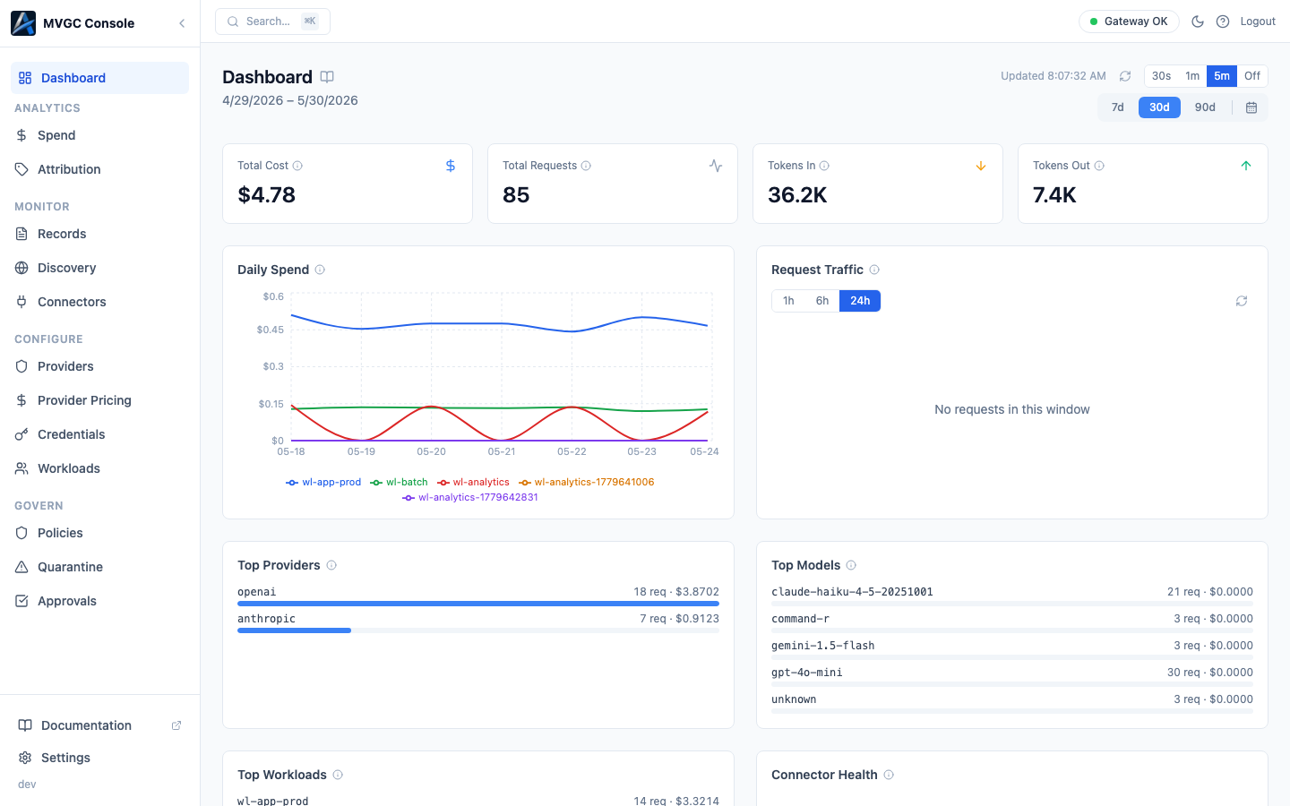
Period and refresh controls
Two independent controls sit at the top right of the page.
Period selector: 7d, 30d, 90d, or a custom date range via the calendar icon. Controls the time window for the metric cards, the Daily Spend chart, and the leaderboard sections.
Auto-refresh: 30s, 1m, 5m, or Off. Controls how often the page polls for new data. You can also trigger a manual refresh with the reload button next to the timestamp.
Metric cards
Four cards appear across the top of the page, each reflecting the selected period.
| Card | What it shows |
|---|---|
| Total Cost | Estimated spend in USD based on token usage and the prices in your Provider Pricing table |
| Total Requests | Count of all requests proxied by the gateway |
| Tokens In | Total input tokens sent to AI providers |
| Tokens Out | Total output tokens received from AI providers |
Each card shows a trend arrow (up or down) relative to the previous equivalent period.
Charts
Daily Spend: A line chart showing cost over time, broken down by workload. Each workload gets its own colored line. Hover over any point to see the per-workload spend for that day. The legend below the chart identifies each line by workload ID.
Request Traffic: A bar or line chart showing request volume over time with a separate time resolution selector: 1h, 6h, or 24h. This control is independent of the main period selector and lets you zoom in on recent traffic patterns without changing the rest of the page.
Leaderboard sections
Four sections rank your activity by volume and spend for the selected period.
Top Providers: AI providers ranked by request count and total spend. A colored bar shows relative volume across providers.
Top Models: Models ranked by request count and spend. Shows the specific model version (e.g., claude-haiku-4-5-20251001, gpt-4o-mini) as reported by the provider.
Top Workloads: Workloads ranked by request count and spend. Useful for identifying which services are driving the most traffic or cost.
Connector Health: Lists all active connectors with their version and current health status. A green indicator means the connector is reachable and operating normally.
Gateway status
The top-right corner of the page shows the current gateway connection status (Gateway OK when healthy). If the console cannot reach the gateway, a warning appears here.